Friday, February 26, 2010

Slicing Tricks...

Once your site is sliced you can "save for web and devices"and save the documents as "images and html"

Now these can be opened in Dreamweaver.

  • Inside Dreamweave you can link each page by selecting you buttons and filling in the "link" information in the properties window. Be sure to set the border size to "0" as it will otherwise default to 1px.
  • Under window > Page Properties, you can set your page background color, title, etc.
  • If you select all on your page you can center your site on the page.
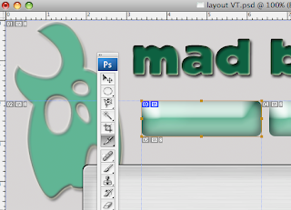
For extra credit: you can make your images/buttons into rollover images, under the image tab you can select inster > rollover image. Be sure you have created a duplicate image with a state change, and you can enter both images (then delete your original).

Wednesday, February 24, 2010

Slicing!!!

Once you have created a web layout we want to "slice" around your buttons using the slice tool:

Use this to draw what will become your clickable area around your buttons. Once you have sliced all your buttons, save-as once for each page of your site. You can now add information and images to each page... Here is a tutorial for this.


Monday, February 22, 2010

Web Buttons...

While creating a web layout for your corporation, consider your buttons. They should fit with your logo stylistically, they should also have some text, again fitting with your logo style...

You need a minimum of 3 buttons on your site layout.
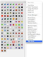
They Styles window may be helpful:

Additionally, you may want to look here for web layout tutorials for more ideas and advanced techniques.

Friday, February 12, 2010

turn in your logos

Turn in your 3 logos to the 1st period classes folder on the staff server.
  • save each image as a .jpeg file
  • place each image into one folder
  • name that folder YOUR NAME_LOGO
  • place that folder in the staff server, 1st period, classes folder.

web layout example


here is a quick an overly simple example of a layout. Your goal is to make your layout fit the style, colors and mood of your logo.

Web Layout

Taking your Corporate Identity, create a web template for that company...

start with a new document as below:

Wednesday, February 10, 2010

corporate logo

Using the text effects create a corporate name of your own design. Make it interesting, legible, and creative. Choose appropriate colors, textures, styles for the name you select.

student example:

Shapes too...

All the text effects you can apply to your text can also be applied to shapes.

Using either the custom shape tool or drawing/selecting your own, also create a symbol/shape/design/logo etc. that will accompany your corporate name. Look at the examples below as most have a simple design to accent their name:

Here are some tips and tutorials specific to corporate logos

Click here for a start to finish guide and example

Friday, February 5, 2010

text effects

Photoshop is not only a photo editing tool, it is also a great tool for creating interesting and amazing text!!!

Click here for a HUGE list of tutorials for generating neat text effects

Our task today is to follow along with 3 text effect tutorials that you think would look interesting with your graphic design company name.

example:

corporate identity & logos...


Here are some tips to keep in mind while designing a corporate logo :

  • Use simple fonts : Some complex looking fonts might impress you at first, but keep in mind that your logo must be displayed and printed on a variety of items. e.g., Font like Times New Roman looks good when printed, but is not so readable on a computer screen. A company’s logo must go on a letterhead, business cards and other printed material as well as on display media such as Computer and TV screens. So go for a fonts which look good on both.
  • Use minimum colors: A colorful logo might appear very attractive when viewed on a computer, but has serious drawbacks. Imagine you choose to order t-shirts or coffee mugs with your logo embroidered or printed. Use of minimum and easily reproducible colors will make your life much easier. If possible, try to design a monochrome logo which looks good on a variety of backgrounds.

Tuesday, February 2, 2010

welcome!

This semester should be fun! We will spend a lot of time in PhotoShop!

  • Academic Plans due back on Monday 2-8-2010